Health Insurance, Trends, Uncategorized
The Single Most Important Chart in US Health Care (rebooted)
Note that we did not say it’s the single most important chart in all of US health care spending. Because it’s more than that.
The magnitude of the difference in health treatment spending that The Most Important Chart encompasses illustrates that the hodgepodge of services and products we lump together as “health care” are widely divergent — so much so as to render lumping them into that one category practically useless for the purposes of evaluating what, if anything, we ought to DO about either the total amount of resources we devote to “health”, or to the wide disparities in how those resources are spread amongst us.
Note also that we have used a chart built on 2014 data; we might have updated it, but a) we’re lazy (note the long gap between this post and our last one) and b) the relationships among the various spending groups have not changed all that much.
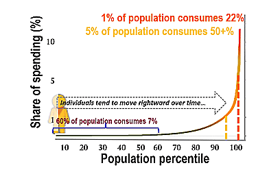
So why is this the single most important chart in all of US health care?
Because it makes quite clear that the distribution of health care, and costs, is not normal*. Which makes thinking about potential solutions to inadequately managed health care costs in “normal” terms almost entirely useless.
Let’s look at health care costs for the “luckiest” 50% of us – those on whom the least is spent in a year (obviously there are people in that group on whom more should be spent, but that’s a conversation for another post). The average annual sum spent on medical care for each person in that group is under $300. If our entire population is 100 people, annual spending on care for the lowest 50% totals $15,000.
On the other hand, spending on the person who accounts for the greatest 1% in our 100-person population is over $100,000 – over THREE HUNDRED TIMES the “health care spending” for each person in the half of the population on whom the lowest average amount was spent. Spending on that single individual is over six times as much as the total spent on the one-half of our population that comprises the lowest 50% of spending.
Thinking about health care and costs that affect half of us in the same terms as we think about the care and costs that impact 1 in 100 of us does not make any sense at all.
The activities, the investment of time, effort, energy, expertise in each of those circumstances are as different as can be. In fact it’s almost kind of kooky to call them both “health care”. To paraphrase the renowned late physicist PW Anderson, on a quite unrelated topic, “more is different“.
Yet the typical health care cost story that you, or I, or anyone encounters in our popular media points to “average” costs — as if we could solve our health care spending problems if only we could control the “average” person’s medical spending more effectively. That is just not an effective way to frame the challenge.
If we are going to “solve” our medical spending challenge, we literally have to redefine what it is we are talking about. We have to think about it in entirely different ways.
*”Normal” here is intended to draw on the term’s multiple meanings. Medical care spending in a sample US population is not normally distributed; that is, spending by member individuals does not cluster around the average for the population. Calling the actual distribution of spending “not normal” is also intended to help the reader understand that s/he needs to think about medical spending issues much, much differently than they are probably accustomed to.